En dedans Type for Giselle New Ballet
Booklet/Motion Posters/Variable Experimental Typeface5.5in*8.5in print
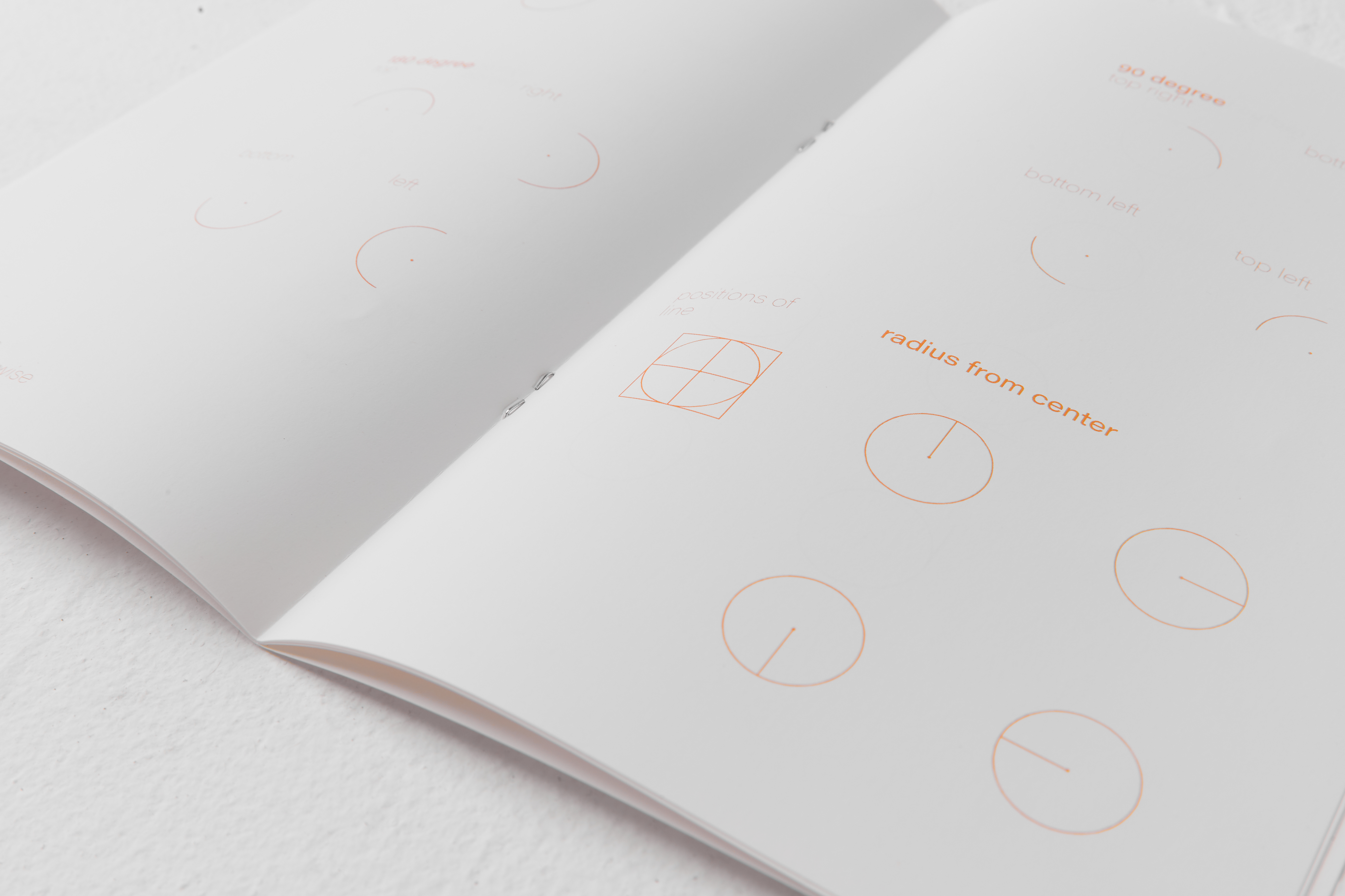
En dedans typeface is made for applications for Giselle new ballet branding. The typeface is inspired from Chinese characters’ rule of forming a matts pattern of squares and patterns of ballet footwork. Alphabet doesn’t follow the Latin typography formation. Instead of having a baseline, uneven negative space, and rags, square character follows a strict pattern made from a tangential circle, encouraging smooth ligatures and diverse visual depth.
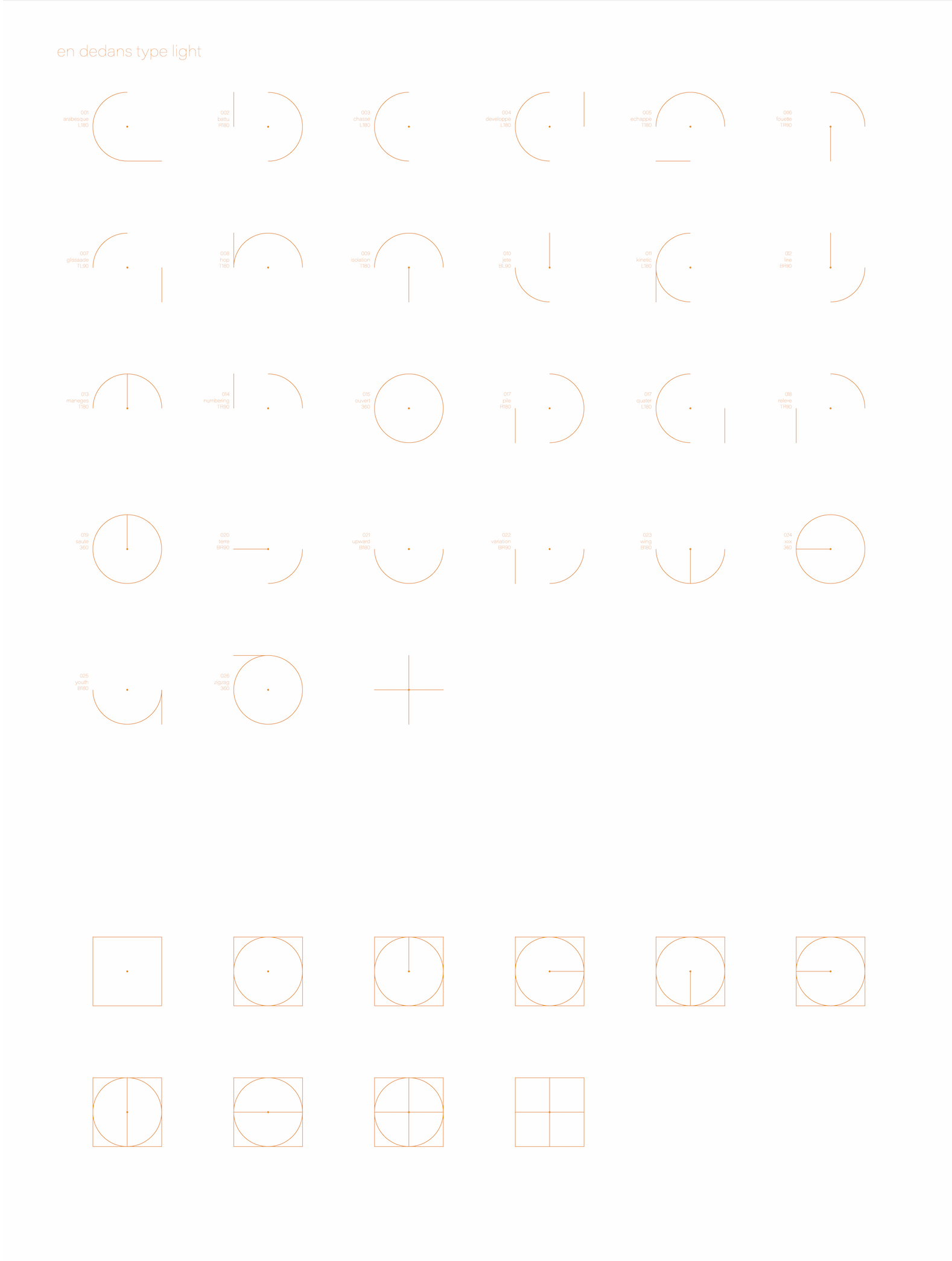
En dedans means inward in ballet, usually anticlockwise. It implies the direction of turning. This light feeling typeface is formed by the movement system of a foot during ballet practice. This typeface visualizes the tracing and pattern of footwork in En dedans direction abstractly. The strict system is indicated with a systematic formation of the typefaces, which is based on a combinations of a tangent circle.
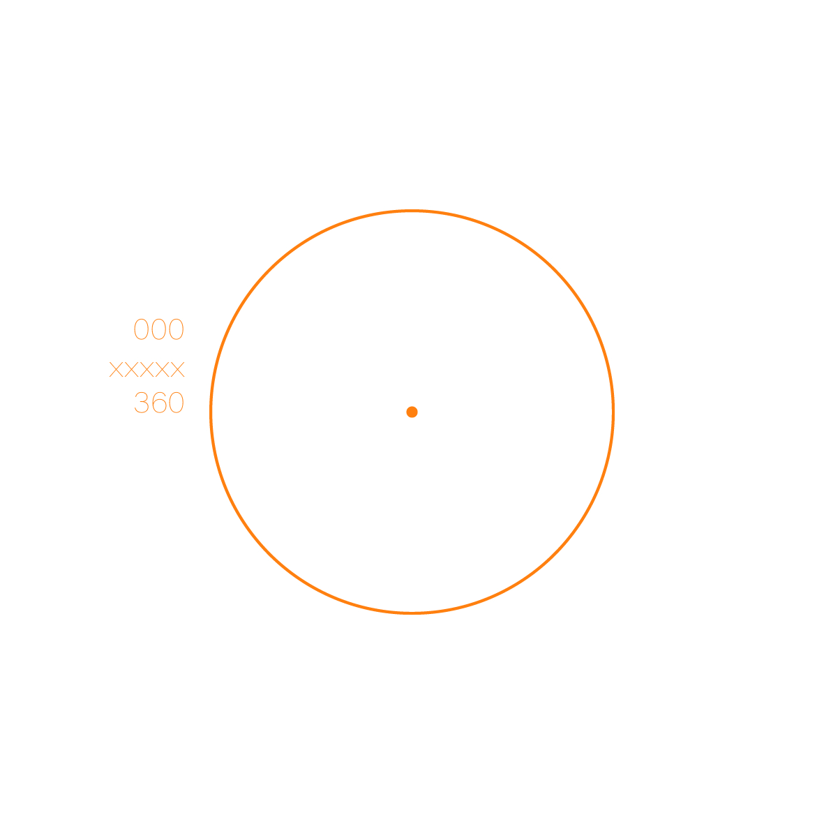
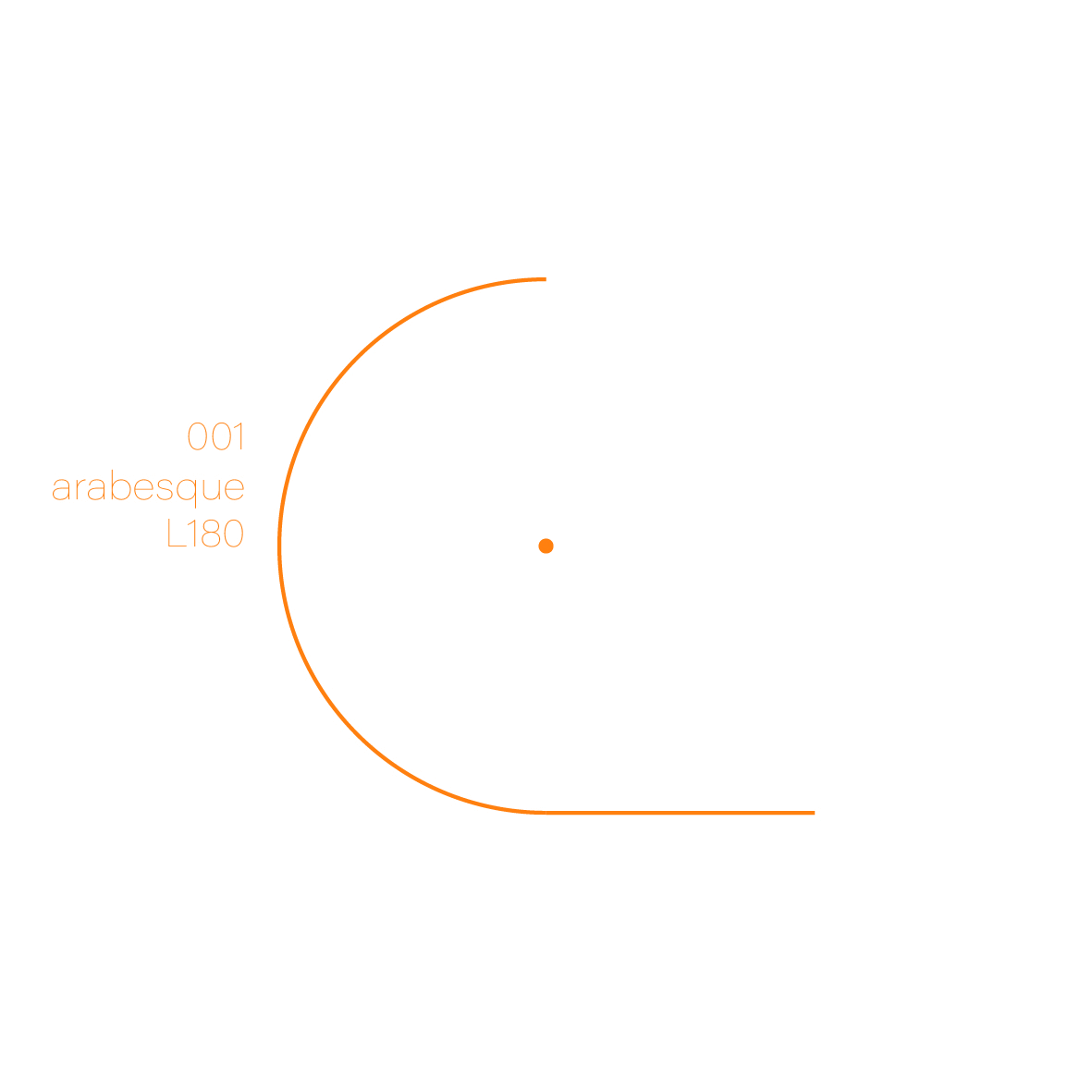
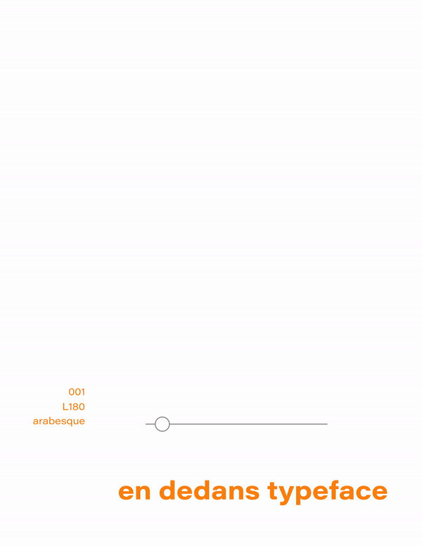
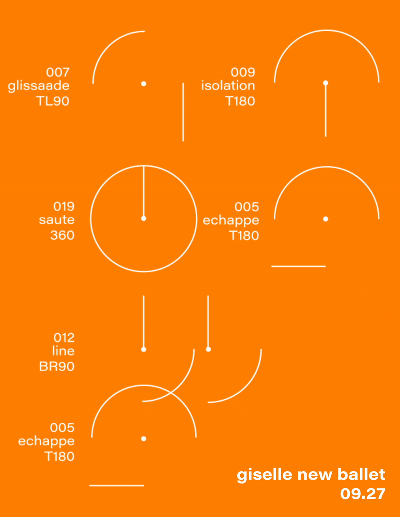
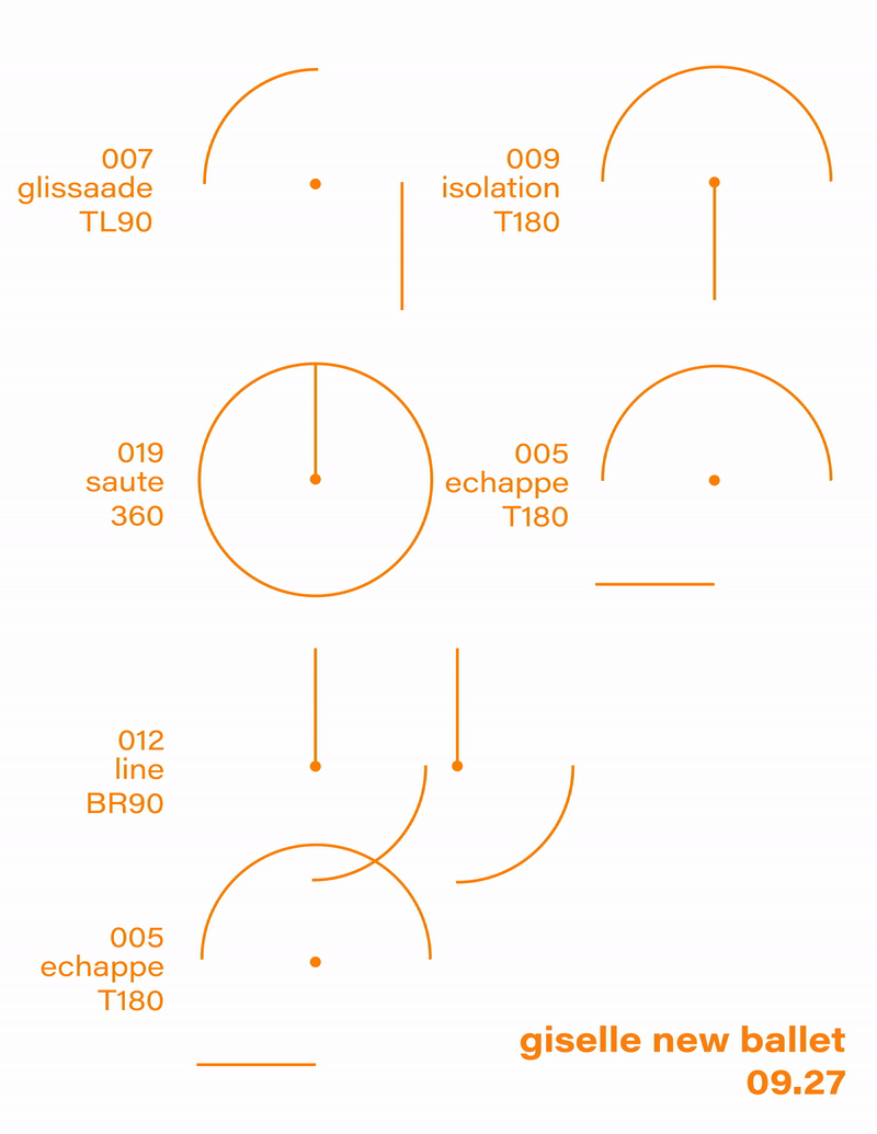
Three lines of text besides the typeface pattern stands for the number in the alphabet, a ballet term that starts with this letter, and the position on stage, which is the corespondent formation that this letter is based on. (BR=bottom right, TL=top left)


From a-z, symbol, and 0-9, the weight of this experimental typeface can be manipulated. This typeface is specifically made for theater and performance uses, such as playbill, banner, and posters applications for a upcoming Giselle ballet performance. Two versions of booklets are printed to illustrate and apply variable weight. The specific color choice is to mimic illumination for a better clarity inside dark theaters.

The Giselle interactive motion poster has a print version to grant a sense of dynamic movement even on paper, and the digital poster emphasizes smooth manipulation ability of the typeface.
